Nicer default directory views for Mac OS

As someone who develops for the mobile web, I often have to deal with the default directory view, listing the files and folders available on my local server.
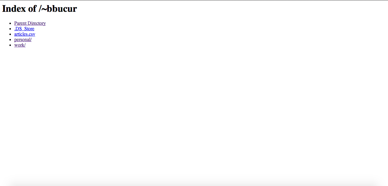
It looks something like this:

On the desktop, it's ok. As a dev, you don't really need something fancy.
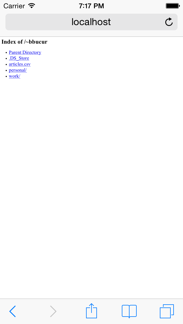
However, on mobile, it's a completey different story:

I don't know about you, but I always have troubles pressing on the right link and a more responsive template, better suited for mobile, could work wonders. Fortunately, this can be fixed.
This great article on This Perishable Press explains very well how to set up your directory views, but what interests us is the part where you add markup to the views.
You can do this by inserting your own header.html and footer.html before and after the generated html of the views.
In order to do this, first you have to edit (or create) your root .htaccess file and add this.
# DIRECTORY CUSTOMIZATION
<IfModule mod_autoindex.c>

# SPECIFY HEADER FILE
HeaderName /~bbucur/.header.html

# SPECIFY FOOTER FILE
ReadmeName /~bbucur/.footer.html

# IGNORE THESE FILES
IndexIgnore .header.html .footer.html .DS_Store
</IfModule>
The only trickier things I did here was to save the html files as .header.html and .footer.html. By having a dot in front of the file names, they will be hidden by the system.
Also, with the IndexIgnore option, you can make them "invisible", so they won't show up when the root files are listed.
The styling part should be easy and up to anyone to do it like they prefer. But if you prefer a head start, take a look at this:
<html>
<head>
     <style>

          * {
          -webkit-box-sizing: border-box;
          -moz-box-sizing: border-box;
          box-sizing: border-box;
          }

          html, body {
               margin: 0;
               padding: 0;
               font-family: Arial;
          }

          ul {
               list-style: none;
               padding: 0;
          }

          li {
               width: 100%;
          }

          li a {
               padding: 15px 30px;
               width: 100%;
               display: block;
               color: #00002d;
               text-decoration: none;
               text-transform: capitalize;
               font-size: 1em;
          }

          @media only screen and (min-device-width : 320px) and (max-device-width : 568px) {
               li a {
                    padding: 35px 30px;
                    font-size: 3em;
               }
          }


          li:nth-child(odd) a {
               background-color: #f3f6fa;

          }

          li:first-child a{
               color: #747372;
               font-weight: bold;
               text-decoration: none;
               border-top: 1px solid #bababa;
               border-bottom: 1px solid #bababa;
               background: #eeeeee; /* Old browsers */
               background: -moz-linear-gradient(top, #eeeeee 0%, #cccccc 100%); /* FF3.6+ */
               background: -webkit-gradient(linear, left top, left bottom, color-stop(0%,#eeeeee), color-stop(100%,#cccccc)); /* Chrome,Safari4+ */
               background: -webkit-linear-gradient(top, #eeeeee 0%,#cccccc 100%); /* Chrome10+,Safari5.1+ */
               background: -o-linear-gradient(top, #eeeeee 0%,#cccccc 100%); /* Opera 11.10+ */
               background: -ms-linear-gradient(top, #eeeeee 0%,#cccccc 100%); /* IE10+ */
               background: linear-gradient(to bottom, #eeeeee 0%,#cccccc 100%); /* W3C */
               filter: progid:DXImageTransform.Microsoft.gradient( startColorstr='#eeeeee', endColorstr='#cccccc',GradientType=0 ); /* IE6-9 */
          }


     </style>
</head>
<body>
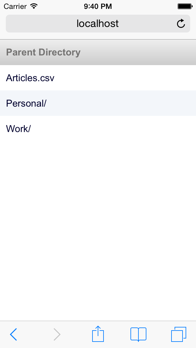
With this code, my default directory view looks like this:

Now I can actually tap the correct link on the first try!
